Here's a glimpse of what's been going on behind the scenes when making our first notebook collection.

This collection is all about colour, so my first port of call was to delve into my favourite resources for colour research. From compendiums of colour to swatch books, I was on a mission to find the ideal hues.

Playing around with colour combinations because each colour needs to work together in pairs, trios and as a group. After all, they'll be sitting on the shelves beside each other (once our shops reopen!). They've got to be individually strong, too. While spending the best part of a decade working with GF Smith papers for various client projects, I've been dreaming up notebooks made with their hues. Embossed textures will add depth to an otherwise flat block colour.

ou may or may not know how much we love burnt orange here at Papersmiths. I knew I wanted to create an orange notebook. But whether to choose tangerine, terracotta or ginger tom cat? Here’s Morello (Sid's cat) with all of the orange-ish swatches and samples. Can you lab dip a cat?

Road testing paper samples. We checked that it was fountain pen-friendly paper and that it would have minimal show-through.

Nailing this next design aspect had to be the most satisfying bit of the process. I never thought that the idea of numbered pages would be within our small business budget for our everyday notebook. It meant printing different artwork on every single page. So when our printer, Rupert, told me this was possible and that I could print every page with different colours, I was OTT excited.

I sought inspiration from all my favourite colours plus a gem of a book; Collecting Colour by Narayan Khandekar. In it, Khandekar takes us through the Forbes Pigmet Collection which is kept at the Straus Center for Conservation and Technical Studies at Harvard University. Khandekar is the director of the centre which contains over three thousand natural and synthetic colouring agents. The edit of pigments presented in the book are arranged in colour order, beginning with Dutch process lead white and moving through Mars orange, purplish murex shell and genuine ultramarine ash.

As you turn the pages of Collecting Colour, you see a rainbow in motion as jars and tubes of pigment fly past. And this provided the inspiration for my Papersmiths notebook page numbers.

They are printed in a gradient of colour that shifts as you flip through the notebook. To create the artwork, I called on my trusty companion The Print Handbook, to make a CMYK colour chart which Rupert printed up for me so I could see how each colour would come out on the printer. The final colour is rarely exactly what you see on screen, and can vary from printer to printer or change depending on the stock you're printing onto. So these test runs were vital.

I went on a journey through the colours on the test prints, settling on the route my page numbers will take, while highlighting the correct CMYK codes on the chart. That was the fun part. Then I spent the entirety of lockdown 2.0 on Indesign, inputting the codes for every single page.

The best zines and gins and jackets are hand numbered, and there's something pretty special about the person who dreamt a thing up having numbered their creation by hand. The first edition of Papersmiths notebooks was a limited run and each creation was numbered. Any excuse to get my pens out!

Six paperback notebooks made up the first collection. We added three more in 2022. All of our notebooks are A5 in size and have a thick 270gsm cover, finished with an emboss which creates a beautiful, tactile texture. Let's meet the gang.
The burnt orange is the colour of the walls in our Chelsea outpost and our first tote bag. A pattern of tiny squiggles is embossed on the cover, in a nod to the marks found on the testing pads in our shops. Named Morello after our favourite ginger Tom cat.


Shop Morello
Cowrie takes its name from the tiny shells we collect on the beaches of Uist. In the urban wild, this delicate shade can be found on the metalwork of the Williamsburg Bridge and was the hue of absolutely everything in our beloved Shoreditch shop (RIP). A rough textured emboss adds some grit, just like the grains of sand on those Outer Hebridean shores.


Shop Cowrie
Lavender linen anyone? Spotted on a puffa jacket in the Marais district at Paris Fashion Week, which led to me accidentally gatecrashing an event. This hue of lilas is finished with a linen emboss. Welcome, Marais.

Shop Marais
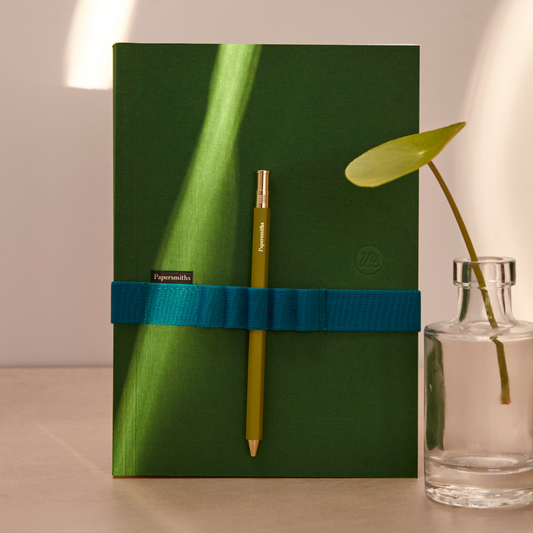
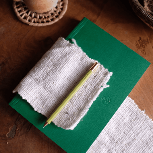
We all deepened our relationships with the grass and trees in our neighbourhood parks during the pandemic. Clissold is my local, but rename yours what you will. Hyde, Heath, Victoria, Preston…


Shop Clissold
Az-u-rite. Named after the azure coloured mineral, this one is a deep blue that warms up in the sunlight, like the skies and the seas. It's finished with a fine linen emboss.


Shop Azurite
Egg yolks? Miniature suns? Daisy centres? Yolk's deep yellow cover is scattered with tiny 1mm disc shapes, bringing a burst of sunshine to your desktop.


You can shop our notebooks here. Stay tuned for more news and sign up to our newsletter here to be the first to know when we release new products.
Sid x









1 comment