After years of dreaming, designing, and fine-tuning, our founder Sidonie has brought the Papersmiths 2025 Diary to life. Each step in the process was a labour of love. Here’s a closer look at how it all came together.
Sidonie wanted a diary that would combine beauty, function, and simplicity. Something compact and structured but still a joy to look at and use. Her goal was to create a planner that felt good in your hands, looked beautiful on your desk, and kept you organised without any extra clutter. Initially, the design was due to launch for the 24/25 academic season, but she decided to spend extra time perfecting it. Choosing not to rush for the initial season but instead to test and refine each detail.
Let's delve into the further details of the design process.
The first step in the design process initially was a general consensul of what we wanted. Sidonie already had an idea based on the years of running Papersimths, seeing what people like in the shops and her own personal preference. When it came to which size to make the diary, it was a decision between a B5 or A4. For the first launch, A5 format felt best. It's easy to carry and fits in most bags and book cases, but is still large enough for comfortable writing.

Choosing the Perfect Materials
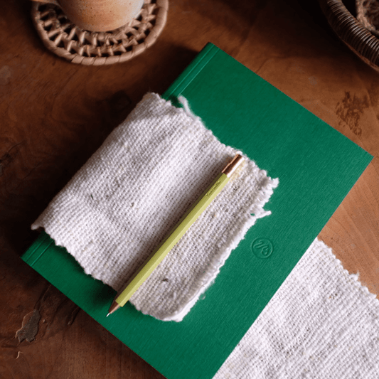
Choosing the materials was Sidonies favourite step. Starting with the cover. After searching for the linen used on our Clifton notebooks, launched the previous year, she knew that she wanted the same durable, soft textures from these notebook covers on the diary. They had high praise, had proven to be durable and looked great. This linen is a vegan, water-resistant book cloth, and having kept the swatches from the Clifton design, she was spoilt with choice. She initially selected seven colours but knew that was too many for a first launch. Eventually, after input from the team and Papersmiths community on Instagram, she whittled the options down to the final four colours. The conclusion started with two familiar shades, Mulberry and Myrtle, from the Clifton range, and then added two new colour options—Burnt Orange and Cobalt Blue. Similar to that of our Papersmiths Morello and Azurite paperbacks that have proven to be popular colours.
Next, the bookmark. It was a clear decision that having a bookmark was essential to help the user find their page with ease. She chose a grosgrain ribbon bookmark made from recycled yarns for each diary. The same material as our Clifton notebook. Sidonie opted for a bone colour, as it easily complement most cover colours, and paired deliciously with the linen cover, creamy paper and a brass binding she had in mind.

Selecting the Paper
The paper had to feel just right. A smooth, 100gsm Inaset paper was the go-to. This paper is a premium, eco-friendly stock that’s perfect for daily use. It's similar to that of our paperback notebooks that had been highly rated for their deliciously smooth paper. It has just the right amount of brightness. Tested with a variety of pens, it proved the all important test of no bleed through, but it feels light, keeping the diary sleek and easy to carry.

Refining the Layout
When it came to the layout, Sidonie used her experiences from running Papersmiths, trying and testing out all of the diaries that have been in the shop and her own to do lists over the years. Her goal was a diary that had a layout offering structure without overcomplicating things. She planned weekly spreads with checklists and habit trackers, along with monthly overviews and dot grid pages for notes. Making sure there were enough note pages, not to overwhelm the diary and turn it into something too chunky to carry about too. Each page had to be functional and intuitive, so she worked closely with a talented UK artworker to polish every last detail, ensuring each page was aligned pleasure to use.

The Binding
For the diary’s binding, it was a clear win for a wire-o bind. It needed to be flexible and lay flat, making it easy to write on for both right and left handed users. She searched for a wire that both felt high quality, in the right size and complemented the linen cover. It took a few samples to find the right wire, testing different colours and sizes. Sidonie found the perfect one to turn the pages with ease, and the brass colour complemented the next element Sid had in mind, the foil.

The Final Touches
Our 2025 Diaries are now available online and in our shops - you can shop them online here.
